

When developing a website, it’s crucial to design and deploy the page’s features with a clear purpose: improving our user’s experience. This means considering accessibility from the very beginning of the design process.
In February 2024, the homepages of one million websites were analyzed to troubleshoot the most common accessibility problems, per criteria of the Web Content Accessibility Guidelines (WCAG). These websites were chosen based on the Tranco ranking.
The analysis was conducted using the WAVE Stand-alone API, with the warning that automated tools have limitations and cannot detect all accessibility issues. In other words, the absence of errors does not mean the pages are WCAG compliant. A thorough manual review, including the use of assistive technologies, is necessary.
Below are the most common accessibility issues found on homepages. I will then outline best practices to help avoid them:
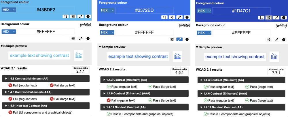
1. Text with low contrast
This is a problem found in 81% of homepages.
The page’s content must be clear and legible for everyone, including people with visual impairments. Compliance with the contrast ratio depends on the level of compliance you want to achieve:
- Level AA is the intermediate level, and requires a contrast ratio of at least 4.5:11 for normal text and 3.1 for large text (18pt or 14pt bold)
- Level AAA is the most advanced level, and requires large text and text images to have a contrast ratio of at least 4.5:1.
Note: Achieving level AA requires compliance with the criteria of level A, while achieving level AAA requires compliance with the criteria of A and AA.
2. Images without alt text
This problem is found in 54.5% of homepages.
Alt text is essential for people who use screen readers and is also useful when images fail to load on a page.
To choose an image’s alt text, it is important to consider its surrounding context, i.e., whether the image is decorative or functional.
- Functional images, such as a button containing only a magnifying glass icon, should have alt text such as
alt-text="Search", so that the button’s action is clear to a person using the screen reader. - Decorative images, such as a picture of a person using a mobile phone, do not need to be read by the screen reader, since they add no additional useful information to the text. The image should have a null alt text (
alt-text=""), or should be added as a background image in CSS.
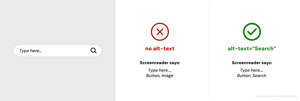
If you have any questions about how to use alt text, please see W3C’s Alt Decision Tree.
3. Form fields without labels
This problem is found in 48.6% of homepages.
In addition to visually associating labels, error messages, and instructions with their corresponding input fields, we must also ensure this association is reflected in the code.
To associate each label with its respective field, the value of the for attribute in the <label> must match the id attribute of the corresponding <input>.
<for label=“name”> Full name</label>
<input id=“name” type=“text” autocomplete=“name”>
This improves navigation for those using a screen reader, as it ensures the label of each field is communicated.
Additionally, clicking the label moves the focus to the corresponding input field, expanding the clickable area and making interaction easier for people with physical or visual impairments, especially on smaller screens.
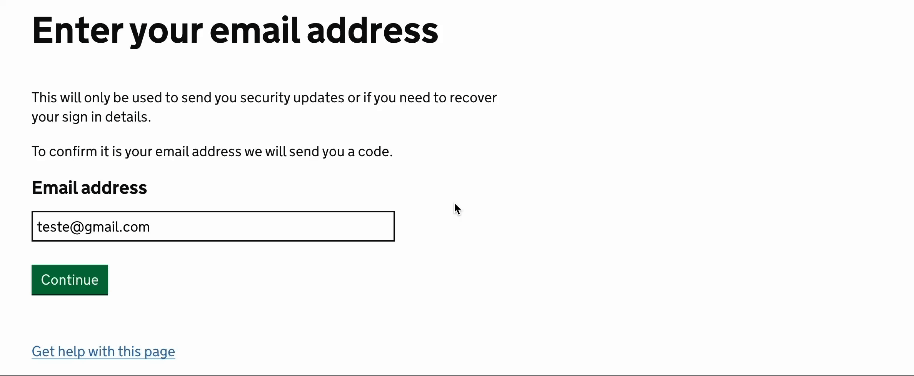
On the British government’s website, gov.uk, form fields are correctly associated with their labels. Clicking on a label highlights the corresponding field with a black and yellow focus, ensuring clear accessibility.
4. Empty links
This problem is found in 44.6% of homepages.
A link should have descriptive text that clearly specifies its purpose, along with an href attribute that defines its destination. Otherwise, it will be an empty link.
We should avoid using vague expressions such as “Click here” or “See more” for the link’s descriptive text, as they can be confusing for people who browse through links with a screenreader or keyboard. If all the links have the same name or a vague name, understanding each link’s destination can be difficult.
5. Empty buttons
This problem is found in 28.2% of homepages.
Links and buttons have different purposes, and should be structured according to their function. Buttons typically perform actions on the same page, such as submitting a form, opening a menu, or closing a pop-up.
To avoid empty buttons, including form buttons, they should have a clear text and a value that describes their function (e.g., form button with value="submit")
For buttons that contain only an image, such as a search icon button, alt text (e.g., alt="Search") should be used. This ensures that screen readers convey the button’s purpose rather than just announcing “Button.”
6. Document without language
This problem is found in 17.1% of homepages.
Determining a website’s primary language is essential for users relying on screen readers, braille translators, or text-to-speech programs. By specifying the default language, assistive technologies can adjust pronunciation, accent, and syntax accordingly, making the content more accessible and easier to understand for a diverse range of users.
To specify the document’s language, use the lang attribute at the beginning of the HTML file:
<html lang=”PT”></html>When incorporating foreign words into your text, we should specify their language using the lang attribute. For example, if the foreign word is in English, add lang="en" to these foreign words to ensure screen readers pronounce it correctly.
References
- The WebAIM Million — The 2024 report on the accessibility of the top 1,000,000 home pages
- W3C — Contrast (Minimum) (Level AA)
- W3C — Contrast (Enhanced) (Level AAA)
- W3C — Non-text Contrast (Level AA)
- W3C — An alt Decision Tree
- W3C — Labeling Controls
- WebAim- Links and Hypertext
- W3C — Button Pattern
- W3C — Language of page (A)
This is the English version of the article Os 6 problemas de acessibilidade mais frequentes e como resolvê-los , originally published in portuguese.
This article was mentioned as a reference in the Galp Design System: G-Power

Leave a comment