
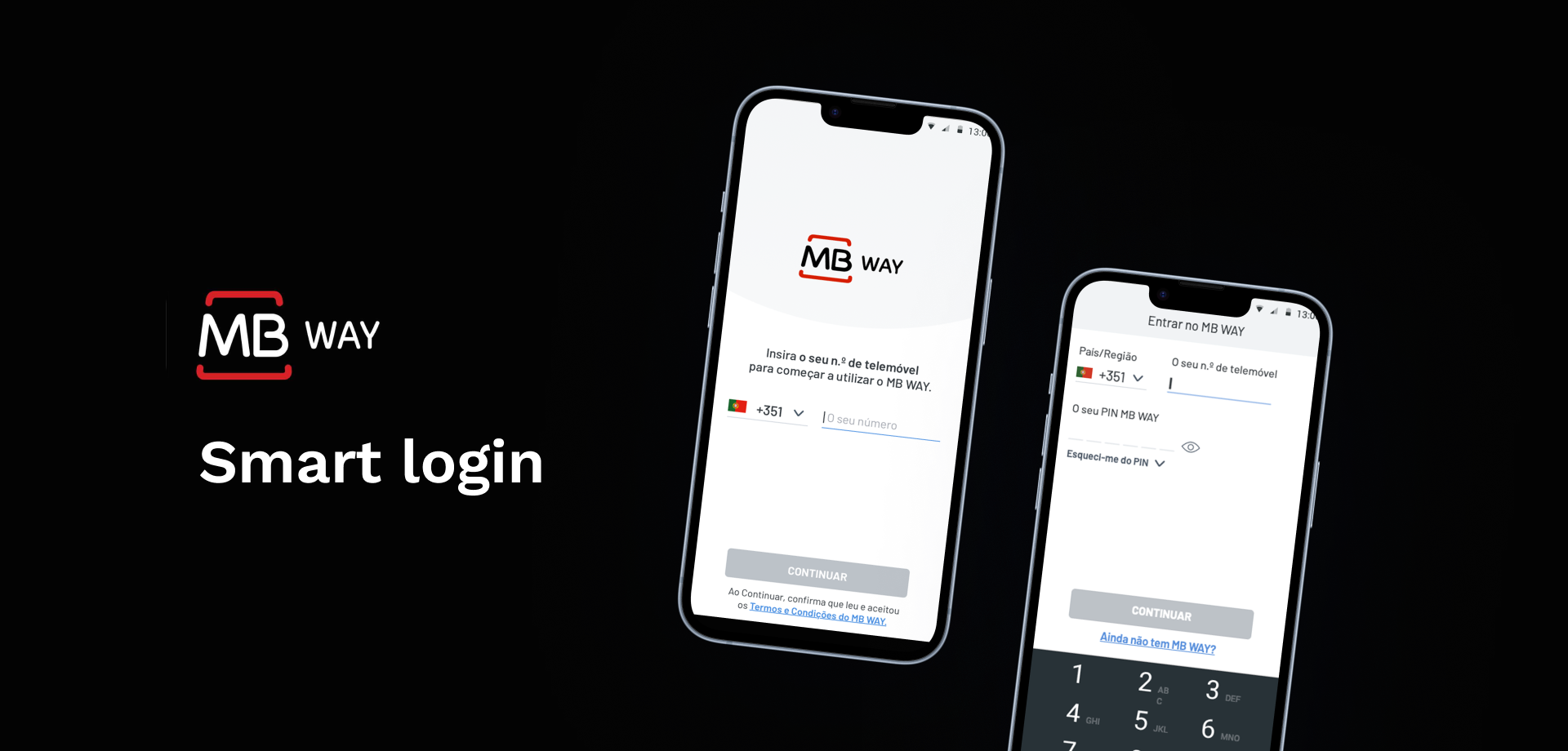
Simplifying MB WAY’s login and registration process
Summary
Using insights from previous usability testing and call center feedback that revealed issues causing user frustration and drop-offs, I redesigned and tested the new smart login process to deliver a more automated and reliable experience.
Product
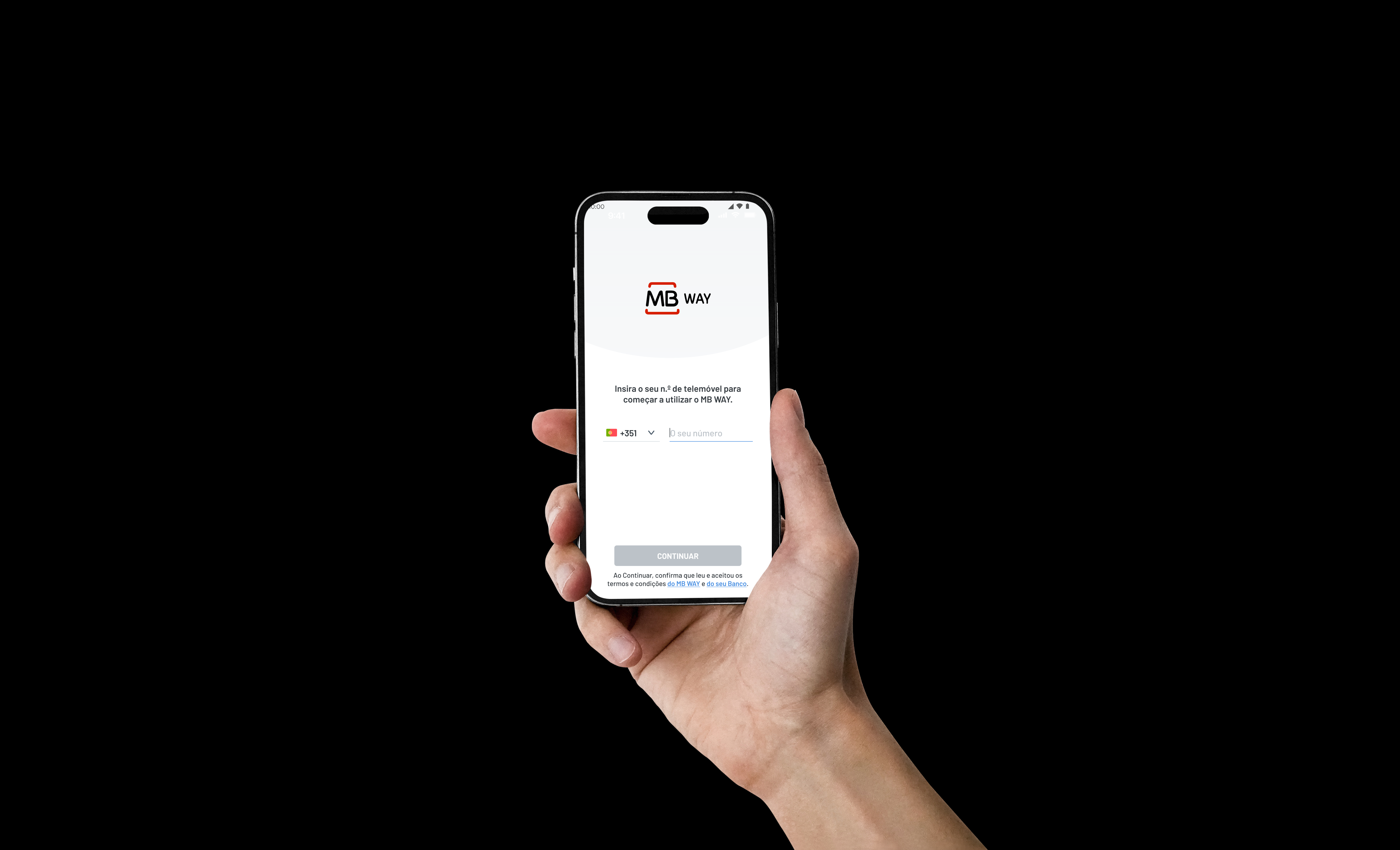
MB WAY is Portugal’s most popular mobile payment app developed by SIBS.
Date
2022-2023
My role
UX/UI Designer and UX Researcher
Softwares
Figma, Notion

The main issue
The main issue was poor usability in the actual onboarding and login flow of the MB WAY app. SIBS knew that many users were unsure whether they already had an account or had activated the service—often without ever having used it—leading to confusion, errors, and friction during access and registration.

The goal
The goal of this redesign was to shift the burden of the login and onboarding process from the user to the system, minimizing human error, reducing client drop-off, and decreasing complaints. The new intelligent flow guides users to the correct path, either “Log In” or “Sign Up”, based on the information associated with the phone number they enter.

The process
Define and ideate
based on insights gathered from previous user testing, call center feedback, and in-store comments.
Design
Test the Figma prototype
with redesigned screens with 7 users.
Design again
to correct any remaining issues from user testing.
Develop
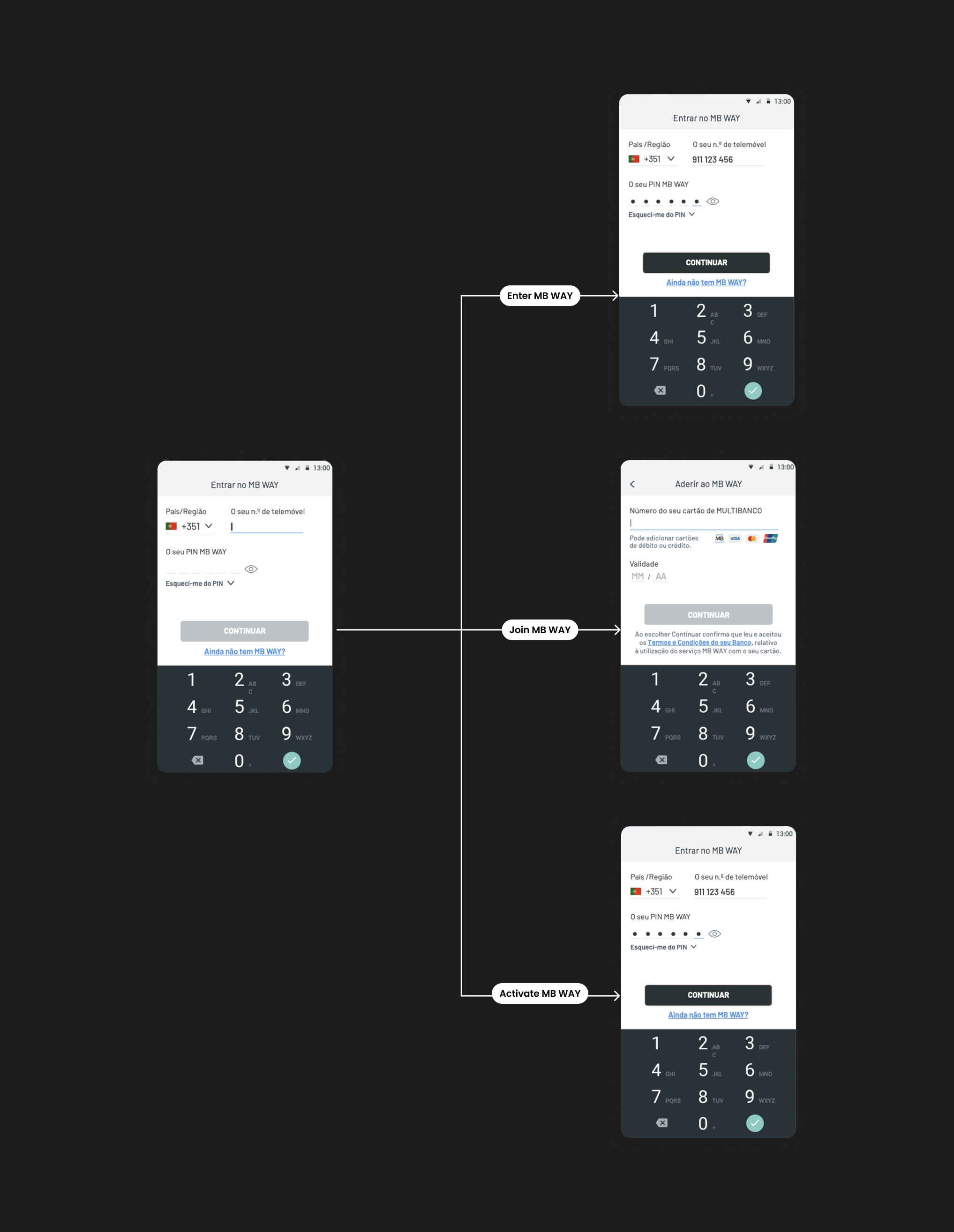
We needed to explore the different login options available to users in the released app…

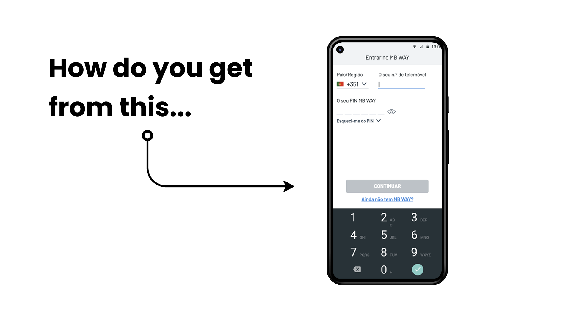
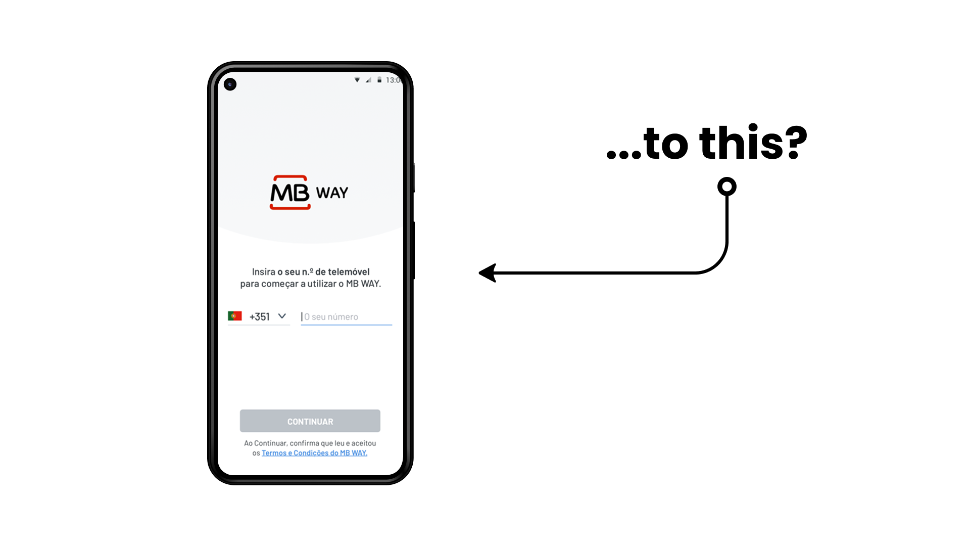
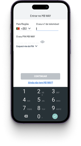
When installing and opening the MB WAY app for the first time, users were required to manually determine and select the appropriate option among ‘Enter’ or ‘Join’, depending on their specific situation.
If the wrong option was selected, the app would return a vague error message, intentionally unclear for security reasons.
Enter MB WAY
in PT: Entrar no MB WAY
- This screen appears when you open the app for the 1st time or if you’re logged out.
- The user will be asked to enter their phone number.
- It is for users with an active MB WAY account.
Join MB WAY
in PT: Aderir ao MB WAY
- This screen appears when the user taps the link “Ainda não tem MB WAY” on the Enter MB WAY screen.
- The user will be prompted to enter their bank card number.
- It’s only intended for users who have never had an MB WAY account associated with their phone number.
Activate MB WAY
in PT: Ativar MB WAY
- The user needs to enter their phone number in Enter MB WAY screen.
- It’s for user with a MB WAY account not activated yet after ATM sign-up.
then create new screens and interactive prototypes for each flow…
…and then present ours prototypes to the users!
The users that talked to us
7
users total
5
didn’t have MB WAY
2
were aged over 60
7
use another app or payment provider
told us positive points
- Join and Activation: users didn’t encounter tasks they couldn’t handle.
- Join and Enter: users had no doubts about the data they needed to enter. Some users felt comfortable granting the permissions requested by the app once they understood how those permissions would be useful for using the application.
but also told us negative points
- Successful sign-up to MB WAY is unclear due to a lack of clear confirmation or feedback at the end of the process.
- The purpose of the location and communication permission requests during login is not clear for some users.
- Users that forgot their actual PIN, never went to an ATM to recover it and stopped using the app.
- Users that couldn’t install the actual app, with the help of friends, never tried again

“I’ve watched videos about MB WAY and seen some communications, but there’s nothing clear or simple that says: ‘Look, to sign up for MB WAY, you need to do this.’ A step-by-step guide. There’s nothing like that. Nothing, nothing, nothing”
— User, 30 years old
What did we do after the usability tests of our new screens to fix the negative points?
1. Added a feedback notification saying “You can now use MB WAY”.
2. Explicitly mentioned “fraud” in the text and updated the image to focus more on security than location.
The final result
Before
The user had to enter their phone number if they already had an MB WAY account or had activated it via an ATM. If they didn’t have an MB WAY account, they had to select the link “Don’t have MB WAY yet?”
After
The user only had to enter their phone number. Based on the information associated with that number, they were automatically redirected to the appropriate flow: Enter, Join, or Activate MB WAY.


What did I learn?
Design for the user, not the system
It’s always better to place the burden on the machine rather than the user. If something can be automated or predicted, it should be, so users can focus on their goals, not the interface. Also, the users didn’t need to know the difference between Enter MB WAY and Activate MB WAY.
Minimize cognitive load and don’t make the user remember account details
Many users don’t remember if they’ve created an account, activated it, or what their current status is. Instead of relying on the user’s memory, I should design systems that guide users to the correct entry point. Eliminate unnecessary steps, automate where possible, and build experiences that “remember” for the user.
Test early and often, because no design is perfect from the start
Designs always need refining. By consistently testing with real users, I can uncover issues and opportunities that aren’t obvious on paper. Iterative testing helps me improve the experience step by step, ensuring the final product truly meets user needs.
Test in real environments for better results
Prototype tests are useful but don’t show the full picture. Limited features and fake data mean users don’t experience the system like they would for real. Testing in a real environment helps catch problems and behaviors that only happen when the system is fully used.
First impressions matter
If users struggle to use the app on their first try, they’re likely to give up. Confusing interfaces or unclear instructions create frustration, especially in early moments. A smooth, intuitive first-time experience is essential to keep users engaged and coming back.

